

Project Open Hand
Project Open Hand is a non-profit organization that provides medically-tailored meals and groceries to critically ill neighbors and seniors. This project sought to redesign Project Open Hand’s website to attract more one-time volunteers. This was a speculative coursework project at General Assembly.
Project Overview
Challenge
The one-time “Volunteer Hot Spots” program is not readily accessible to users due to poor navigation and confusing terminology.
Solution
Increase the accessibility through updating the internal navigations and adding the external route
Update terminologies to better represent the program
Role
UX/UI Designer, UX Researcher
Time
2 Weeks
Team
Chloe Han, Darren Anorga, Howard Kim
Tools
Figma
>Research<
Business Analysis
Our team began the project by exploring Project Open Hand’s business landscape. Since we didn’t have much knowledge about non-profit organizations, we needed to learn about the business model that Project Open Hand was based on and the operation scene to reflect on the design work.
Main Findings
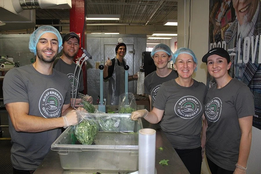
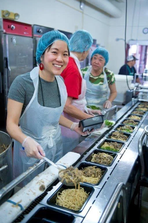
The organization relies on volunteers for meal assembly, packaging, and delivery so volunteers' input is invaluable to the organization’s operation.
In the fiscal year of 2019 to 2020, volunteers donated 58,165 hours which values at over $1 million and it equals about 13% of the total operating cost in the same fiscal year.
These findings confirmed the importance of the volunteers in terms of monetary value as well as a critical stakeholder in the operation. Also, we scoped down our focus to the “Volunteer Hot Spots”, the one-time volunteer shifts, as more volunteers participated in the one-time shifts than the regular shifts.
Heuristics Evaluation
We used Nielsen Norman Group’s principles to evaluate the usability heuristics on the website. We identified various critical issues around the “Volunteer Hot Spots” program.
Card Sorting
Card sorting was used to learn how users perceive the website’s primary navigation. Users expressed great difficulty with understanding what some menus were communicating without knowing any context about the website.
No participants drew a connection between the “Volunteer Hot Spots” to the one-time volunteer opportunity. 5 out of 6 participants organized it with other menus including the word “Volunteer”, but they felt out of context and it slowed down other menus’ grouping process.

User Interviews
Our team asked interviewees about their volunteer experiences, reason, goal, and the process.
Major insights
3 out of 4 interviewees have found volunteer opportunities through a personal connection.
75% of interviewees choose volunteer programs based on their interests and goals.
3 interviewees said that flexibility in time is one of the biggest factors that influence their decision on the volunteer program.
User Persona
Based on the interview findings, we were able to create a user persona to help us focus on solving the specific problems and make the following design decisions around them.
Meet Daniel!
He is 30 years old living in a city and working full time.

Behaviors
Always looks for a volunteer opportunity
Interested in issues within his community
Likes to make friends through the volunteer program
Has a tight work schedule
Needs and Goals
Wants to volunteer more during his free time
Wants to connect with community organizations that align with his passion
Needs a networking community/group that can connect him with volunteer opportunities
Pains
Can’t find an organization that offers flexible opportunities
Gets confused/hesitant when the program doesn’t provide enough information about the volunteer opportunity
Journey Map
>Define the Problem<
Based on the findings from the research on the business and users, I draw a diagram to see where the business goals and user goals meet.
Design Solutions
I listed the design solutions based on the project goals I identified from the overlap of the business goals and user goals.
Reorganizing the secondary navigation
Adding a customizable filter function to find a volunteer opportunity in a more convenient way
Implementing a referral feature
Updating the terminology to reflect the real-world examples
>Ideate<
These are the design solutions I made for each page.
Landing Page
One-Time Volunteer Overview Page
One-Time Volunteer Detail Page
Landing Page
Current Website
New Design
One-Time Volunteer Hot Spots Page
Current Website
New Design
User Flow
The current user flow includes four paths to find a 1-time volunteer page, but there was confusion due to the use of three different terms to describe the “Volunteer Hot Spots”.
In the updated user flow, there are two direct paths to find a 1-time volunteer page and they are all labeled with one term.
High-Fidelity Prototype
UI Kit
Reflection
What I learned…
I learned a lot from this project as I went over the design process one more time by myself based on the feedback on our team’s first proposal. Through the reiteration, I focused on solving the main problem and I was able to come up with the design solutions that clearly resonated with the research findings. Also, from this project, I learned that the goal of a design process is not a fixed answer, but rather it works in a reiterative manner with a possibility to improve.
What I could have done differently…
One thing our team could have done was the second round of card sorting. In the first card sorting, there was a lot of confusion around the terminology so we could have done one more with the improved terms.
Next step
The next step would be to do the usability testing and modify based on the feedback from the usability testing to keep improving.